How To Build The Perfect Squarespace Online Portfolio
All creatives, from Photographers, Illustrators, Graphic Designers and Web Designers to Film Makers, Copywriters and Stylists need a website that’s attention-grabbing and a joy to browse. It should make potential employers, agencies and clients desperate to work with you. Whether you’re a student or a professional, you’ll have built up a body of work to be proud of, so to get hired you need to show it off in the best possible setting.
Following our founder Allie Astell's talk for Squarespace at the D&AD New Blood Festival 2018, here are her 10 top tips to help you build a high impact, effective online portfolio. If you'd like to view highlights of her presentation, you'll find the film at the bottom of the page.
1: Audience
Establish a tone of voice and personal brand.
Will you use a logo or type font?
Is your style going to be corporate or informal?
What will your colour choices be?
Will your portfolio be very ‘now’ or timeless? Current trends include:
Animation/video,
Bold colour choices
Creative use of typography
Using gradients and shadow (versus flat use of colour and imagery in the past)
Illustration
Clever and innovative new ways to translate the website to mobiles
Potential employers, clients or agencies will all need a different approach.
What do they want to read and see?
Put yourself in your audience’s shoes as you think about all of the above.
2. Plan your website first
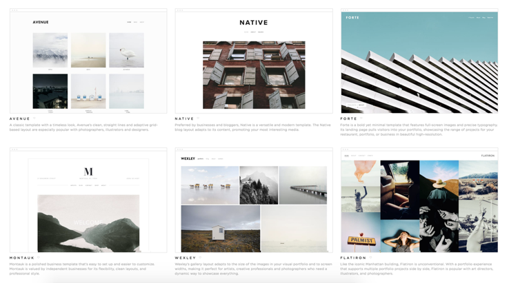
Template selection
Pick a template that suits your content
Will your portfolio be image-led, copy-led or a mixture of both?
Do you want your portfolio to be straightforward and static or would you like parallax scrolling, and lots of movement as your audience browses the website?
Do your research carefully
Think of your Site Map, User Journey and User Experience
Clear navigation
Minimum clicks
Browsing should be a fluid, easy experience
Preparation will make the build much easier
3. Simplicity
Don’t overcomplicate your portfolio with too many special effects and coding
You don’t want to slow down the performance of your site and this could lead to a high bounce rate (people leaving the site within seconds as it takes too long to load)
Today’s culture is one of instant gratification as people have limited time
You need to make an impact quickly
Build a clean, fast loading and easy to navigate portfolio
Your website should have clarity
It needs to be a as easy as possible for your audience to browse
4. Be selective
Determine who you want to work with
What kind of work would you like to do in the future?
Is there any work that you’d rather not advertise as it’s not really something you enjoy or want to pursue?
Choose your best, relevant projects
People could be ‘blinded’ by too many case studies or projects and not spot the ones that are your highlights
Be ruthless as less is more
Create intrigue – don’t give everything away
Don’t make personal choices
Seek a second opinion from a knowledgeable source and listen to them
If you can, request a portfolio review to hone your choices
5. Tell a story
Provide a description for each piece of work
You could have a caption per project, or per image/piece
Start with a teaser, then lead to full details if you want to keep things minimalist
Be clear and succinct
Get your point across, but don’t waffle
6. Keep your design clean
Choose a template that’s simple, intuitive, and easy to navigate
As with your portfolio selection, don’t make personal choices based on the sample content in the templates or your own taste.
Think of your audience and what they want to see
Check your website carefully for important design elements
Stick to a maximum of two different fonts - one font for headings, and another for body copy or you could choose to use just one font throughout the site
Check your spacing and formatting
Proofread carefully as any typos will give a bad impression
Don’t follow a temporary web design trend unless you have a strong reason to
These will have a short shelf-life so bear in mind you’ll need to start again once the trend has passed
7. About you
Include an interesting bio
The style will depend on your audience
Will you speak in the first person or third person?
Will it be informal or corporate? Fun or straight?
Detail your achievements, experience and awards
You should have a minimum of two paragraphs, but it could be much longer
Try and be unique in the way you write it
Think about an interesting way to sell yourself
It’s your one shot, so make it count
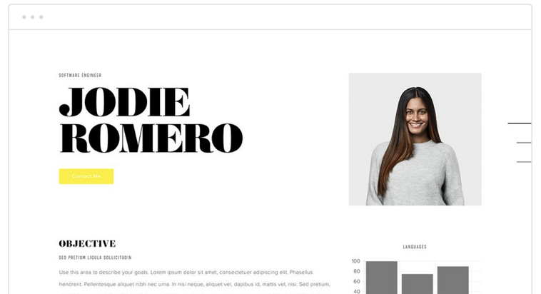
Include a headshot
A photograph of yourself will instil trust, especially if you’re not likely to have face-to-face contact with your potential clients or employers
Think about the style of the shot – will it be fun and quirky, corporate, in a café, in an office, outside, against an interesting background or a plain one?
8. Contact is key
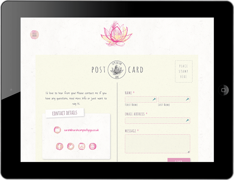
Include a very obvious contact page
Give clear and easy ways to get in touch
Include email, telephone, an online form, and any other methods that your prospective clients can use
Try and allow plenty of contact opportunities across your portfolio
The more chances there are for someone to contact you the better
Consider including a contact form or button every page
Encourage follows for your social, emails and blog
Include email subscribe areas linked to Mailchimp lists
Add social media links
Add a Twitter feed
Add an Instagram feed
Promote your blog on your homepage by including a feed of your latest posts
9. Catch Google’s Eye
You need relevant content with regular updates
Many creatives are tempted not to include much if any word content, however this is crucial
Without clever and natural use of the keywords and phrases you want to be found under, the search engines will have no way to find and then rank your website
Update your portfolio as often as you can with new work, news and blogs – the search engines love fresh content and rank stagnant websites lower
Back-end work for SEO is vital
Site title, site description, page titles and page descriptions
Alt tags (image titles)
Headings 1, 2 and 3
Tags and categories for galleries, events and blogs
Image optimisation (file size) – each one should ideally be under 500kb in size as large sizes will slow down performance
Disable or delete redundant pages
The search engines will crawl every element of your website
Make sure that if you’re working on a page that you have yet to finish, or if you have old pages that you might come back to one day, they’re not visible
10. Be responsive
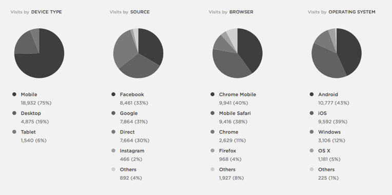
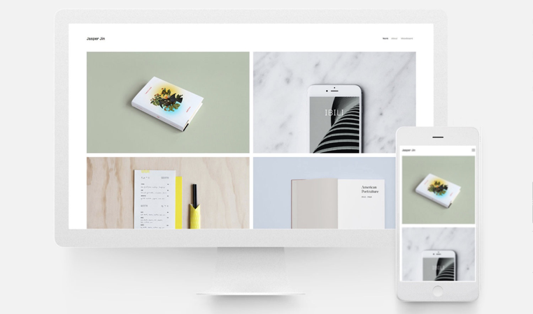
Your website must look fantastic across all devices and browsers
52% of worldwide web traffic in now generated via mobile phones as opposed to 0.7% back in 2009*
Google now penalises websites that aren’t responsive and of course SEO is vital in your mission to promote yourself and your work
There are hundreds of online platforms available to preview your website – for example Chrome Responsive Web Tester and Browserling. If you can do real checks with your friends’ or colleagues’ devices and browsers, then make sure that you do
Devices
• Desktops
• Tablets
• Smartphones
Browsers
Chrome (58.94% worldwide web traffic) **
Safari (13.7% worldwide web traffic) **
Firefox (5.17% worldwide web traffic) **
Internet Explorer (3.12% worldwide web traffic) **
* Source: statista.com
** Source: statcounter.com
A quick recap
Think of your audience
Plan your website first
Don’t overcomplicate
Choose your work carefully
Write captions for your work
Keep design clean
Include a short bio
Make it easy to contact you
Think of the search engines
Test your site on all devices and browsers
By following the advice above, you should be all set to get hired by the people that matter. Good luck!
Start your free 14-day Squarespace trial today or get in touch if you'd like our help.

